
AIDS maps
I love maps. I can spend hours looking at a particularly interesting representation of just about any geographical area, which is why Google Earth is really dangerous.
I also love charts - a good graphical depiction of data can really get me thinking.
I really love it when the two are combined, especially in the form of a cartogram, a re-proportioned map. There were a lot around showing the US by population after the 2004 election debacle, a sort of cathartic "we're not that tiny" scream by spatial-visualization-inclined Democrats.
I finally got around to making some of my own; here's my first set, comparing wealth to AIDS in the world:
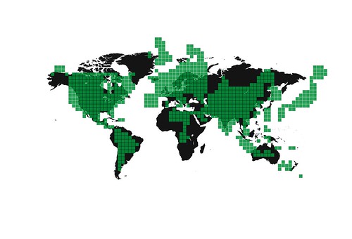
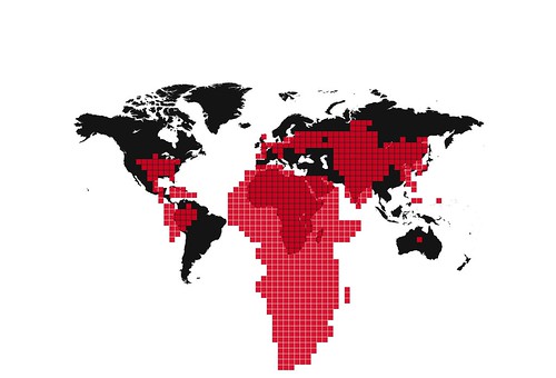
Yes it's too late, no this isn't healthy. But when depressed, I get very creative.
I also love charts - a good graphical depiction of data can really get me thinking.
I really love it when the two are combined, especially in the form of a cartogram, a re-proportioned map. There were a lot around showing the US by population after the 2004 election debacle, a sort of cathartic "we're not that tiny" scream by spatial-visualization-inclined Democrats.
I finally got around to making some of my own; here's my first set, comparing wealth to AIDS in the world:
Yes it's too late, no this isn't healthy. But when depressed, I get very creative.
posted by onlooker at 4:39 AM
![]()
![]()


1 Comments:
Excellent, that was really well explained and helpful
Post a Comment
<< Home